Archive
Archive
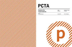
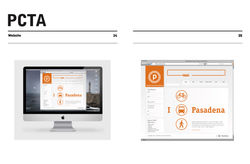
Pasadena City Transit Authority 2012
PCTA was the product of a sponsored project I did on a stipend from the City of Pasadena. This was done through Art Center College of Design where I was working on my graduating portfolio. I had a real interest in LA Metro at that time and I wanted to get the attention of Michael Lejeune who is still Creative Director there as of 2022.
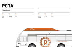
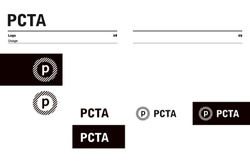
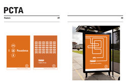
My concept behind this brand was a humanist approach to Massimo Vignelli's international style rebranding of the NY Metro. Pasadena is not a big city but it gets a massive amount of attention and it needed something with... authority. I altered the name and made reference to Pasadena oranges wherever possible, feeling that the rose had been over used and over represented. I softened the Swiss approach wherever I could with graphic and patterns that felt fun, clever, and engaging. The product of this concept is shown below in an old and unfortunately low res pdf. I retain physical copies to show.
Ultimately this concept was chosen by the City of Pasadena however later my logo (name change) and orange color palette (technical issue with LA Metro) were found to be unacceptable. A designer on the project who had a more appropriate color and logo treatment was selected to implement my designs which can be seen on Pasadena busses today. Lejeune had a positive response to this result however I ultimately decided not to apply at LA Metro.
 |  |  |  |
|---|---|---|---|
 |  |  |  |
 |  |  |  |
 |  |  |  |
 |  |  |  |
 |